Whenever this subject arises, or whenever a writer wonders how important his or her title really is, I always side with the camp of Very Important Titles (And Covers.) This has, on occasion, been met with open sarcasm from certain forum regulars who will remain nameless and with snarky rep comments...par for the course on AW, where one must expect passionate behavior because the whole place is just crawling with writers. (I love AW; don't for a second think that I am disparaging it by characterizing it. It's the only thing any writer needs, I believe, to become a pro.)
Primarily, I push people to pick good titles and to be wary of bad cover art because I am a voracious reader, and I know exactly how influenced I am by titles and covers. To make this situation worse, I work in a used book store and am exposed to all kinds of interesting books in all their various edition-incarnations all day long. I am battered by a smorgasbord of book marketing.
Cover and title tell a potential readers SO MUCH about a book.
I really think their importance cannot be overstated. Title instantly clues the reader into the genre of the book: Written On the Body likely conjures a particular type of writing or theme when you read those words together; What A Rogue Desires conjures another image. As Hot As It Was You Ought To Thank Me will likely give you all kinds of ideas just based on the length and languor of the title; Get Off The Unicorn will give you all kinds of different ideas. Combine these little soundbites of imagery we call titles with physical images -- the cover art itself as well as the design of all the visual elements (title, author's name, artwork, even imprint label) and you have a perfect package of marketing goodness right in your hands, that will attract exactly the kind of reader who will love your writing and will allow the kind of reader who will have no patience with your tomfoolery to pass you right by.
Hopefully.
Sometimes covers and titles go wrong in a variety of ways. I'll explore the wrong turns a bit as this mini-series progresses.
My point here is this: Nothing reaches out to a reader with a more firm hand than the combination of title and cover. Authors need to do everything in their power to put the best titles they can come up with on their books, even during the query phase (agents and editors are readers, too, and will still be swayed by marketing) and it behooves the serious writer of fiction to work with an agent for many reasons; the advocacy you get from an agent when the publishing house presents you with inappropriate cover art is just one reason.
Covers and titles are your allies.
So here comes the first in a series of blog posts wherein I pull actual books from the actual shelves and actually read them based on their covers and/or titles. I will tell you why each one caught my eye, what I expected from it, and whether it delivered what I expected (thus determining whether the book was successful in reaching the appropriate kind of reader with its marketing ploy.)
Book 1:
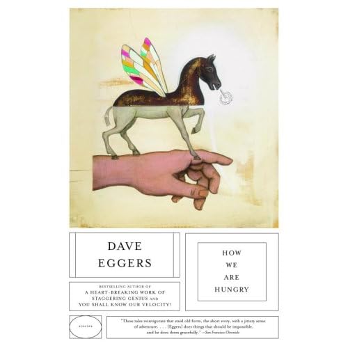
How We Are Hungry by Dave Eggers
What attracted me: The title got me first, and to some extent, the design. This simple and unusual title is laid out on a clean white spine in very plain, very readable text. It stood out among more colorful and darker spines with more scrolly or fancy script. It gave me the immediate impression of starkness. I like starkness in my reading material. I pulled it off the shelf and examined the cover, and was strongly attracted to the strange whimsicality of the art. The movie-poster-like geometrical sequestering of the title, author's name, and blurbs are just quality branding: Eggers' other books have similar design so this was quickly recognizable as a Dave Eggers book.
I was so drawn to the weirdness of the cover art and the promise of stark simplicity that I flipped open randomly, located a flash story titled "What It Means When a Crowd in a Faraway Nation Takes a Soldier Representing Your Own Nation, Shoots Him, Drags Him from His Vehicle and Then Mutilates Him in the Dust." Being that it was very short, I read it right there, standing at the shelves, and decided I could give the rest of this collection a try.
This cover and title got me, and that's pretty remarkable.
Why this is remarkable: Being that I am a writer of literary fiction, I try very hard to keep up with what's current and popular in my genre. This means I have tried very hard to read Dave Eggers, but just can't make myself. After a few years of resisting, I worked past the eye-popping bombast of the title "A Heartbreaking Work of Staggering Genius" and started to read the book. The unnecessarily long and goofy prologue so exhausted me that I didn't care enough by the end of the first chapter to keep going, despite recognizing that it was technically really nice writing (if you don't consider the prologue stuff.) I then tried You Shall Know Our Velocity!, but again, in spite of technically nice-enough writing I found I didn't care at all about the main characters' predicament to read past the first chapter. I decided Eggers wasn't for me, so I was surprised to be drawn in by the cover of How We Are Hungry, and to be moved by the simple beauty of the very short story I read. I have high hopes that I'll enjoy the rest of this collection.
Book #2:
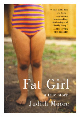
Fat Girl by Judith Moore
What attracted me: First, the title. It's snappy and short, and it pretty much tells you what you're going to get. This is a memoir, which works well with the slightly blurred snapshot cover, of a really-not-very-fat girl in a bathing suit, standing in some kind of lame suburban yard. I picked this one out of a pile of memoirs waiting to be shelved and read it on my lunch break. Or started to, anyway. As it turned out, this book was not what I expected based on its packaging.
Why this book failed in its mission: Kudos to the author for being honest with her readers: She says right at the outset that this isn't a book in which anything pleasant happens, and she delivered on that promise. Thanks in no small part to the blurb from Augusten Burroughs on the front (he's known for his witty memoirs) that promised this book was darkly humorous, I was hoping for a darkly humorous reminiscence of what it's like to grow up as an obese young woman in America. I hoped for some interesting anecdotes that would break my heart and make me respect the pluck of the author; I hoped for a memorable voice and a little strength and resistance. Instead, I got a depressing laundry-list of everything the author has ever eaten, along with unrelenting reasons why she has always hated herself and continues to hate herself. Perhaps it was the bright and cheery bathing suit on the cover or the sass of the title, but this definitely was not what I'd thought it would be. In several chapters there was no humor at all that I could detect, dark or otherwise. I stopped reading when my lunch break was over and had no desire to return to the book again.
The wrong packaging for a book (that includes title and cover) will set a reader up for disappointment. Do you think a reader is likely to buy another of your books if your first was not anything like what they expected? This reader isn't likely, I can tell you that!
Book #3:

Mariette In Ecstasy by Ron Hansen
What attracted me: I won't lie, folks. Nothing stood out about this book when I was browsing the shelves. Its title is not particularly gripping (especially without the context of the cover art) and the edition I have was older, with the faded pastel-orange text of the mid-nineties. I actually pulled this book off the shelf to put it in clearance and make room for another, newer book...but I stopped when I saw the cover.
It's a painting of a woman having an orgasm.
I am pro-orgasm, so my curiosity was instantly aroused (ahem).
I flipped it open and sampled some tidbits of the prose, which I found palatable enough, and noted that it's told (at least in part) in a series of inquisition notes, as if a character is being interviewed about her participation in something urgent...perhaps a crime? The slimness of the book combined with the unusual storytelling mode sealed the deal, but it was mostly the picture of Mariette in ecstasy that got me.
I'll read anything sexy, especially if it's attached to really great prose.
Too early to tell whether this one was a success, as I haven't yet started reading. But I did buy the book, which is a sign that I fully expect to enjoy it.
I hope you found this very long foray into titles and covers enlightening. There will be more to come, but in shorter form, since I got all the explaining of what I'm doing and why out of the way here. Feel free to discuss, please, by all means! This blog needs some action or I'm going to just let it die.
cheers!
Lib
I am also pro-orgasm. Really people who are anti-orgasm have issues, although probably nothing a good shag wouldn't help.
ReplyDeleteCover art/titles definitely play a role when I am shopping for a book. The only think more important IMO is the writers name (i tend to read everything I can get my hands on once I find an author I like)
Of course what makes a good title/cover is very subjective. I would not have grabbed any of those books off the shelf. I like a very clean uncluttered cover.
Since I am partial to fantasy this can be hard to find but it indicates, not always accurately, clear uncluttered storylines to me.
"A Game of Thrones" is a wonderful example of my ideal cover art. Diana Gabaldron's "Outlander" series is another. Both of these series became instant favorites of mine after being initially attracted by cover art
Yes, cover art is totally subjective, which is why this is so fascinating to me...so many different outcomes for a given cover. More people need to do Cover And Titlefest on their blogs! It's fun!!
ReplyDeleteAW is crawling with writers? You make us sound like a bunch of cockroaches. *grin*
ReplyDeleteI love the Cover and Titlefest idea. I could have a ton of fun with that.
PD Dooley
@Paula: we are! we are writerly roaches, crawling through nooks and crannies, sometimes nibbling leftovers, while we attempt to create something that cannot be killed. :D (ooh! That was good, eh? lol)
ReplyDeleteTitles/covers vastly important: they are the bait! no fish wants to nibble a dead worm. it has to have a bit of pain and be trying to elude you.
awesome blog, Lib. (I don't get snarky rep points; I get lovely huggy ones)
ps- I am crazynance at AW
ReplyDeleteWould love a crit of my two covers. I'm new to the self-pubbing, self-covering, self-designing world, and while I'm writing erotica, I didn't want to go with the "model has a rubber band up her butt, and makes an oops face" cover. But then I wonder.
ReplyDeleteMy collection's cover is currently being designed...I am bookmarking this entry for future reference! Thanks.
ReplyDeleteI read Mariette in Ecstasy ages ago, so my memory is a bit fuzzy, but I'm pretty sure the orgasm/ecstasy aspect isn't exactly what you should expect when you crack it open. I probably need to re-read.
I love that Dave Eggers cover even though, like you, I've never been able to get into any of his books.
ReplyDeleteI also like the Judith Moore cover, but (combined with the title) it makes me assume that the book is about a teenage girl complaining about being overweight and is therefore of no interest to me whatsoever (which is unfair, I know, because it could be nothing like that at all, but there you go).
Generally I don't care what the cover of a book looks like...reviews, recommendations and previous good experiences with the author are what tend to drive my book purchases.
Which is bad news for Dave Eggers.